App Store Marketing - Vertige

Vertige

The same app, two years apart. This study displays how my design thinking evolved — from building screens to building systems that adapt to real users.

Timeline

1 Month

Role

Visual & Marketing Designer

Deliverable

App Store Screenshot Suite

Tools

Figma

The Brief

Creative freedom with a clear

emotional goal

Vertige came to me through a professional referral. The founder needed an App Store screenshot suite and gave me access to the full Figma file of the

app.

Beyond the technical features, the brief had an emotional dimension. Vertigo affects far more than balance. The anxiety, depression, and loss of identity that come with vestibular disorders were central to who this app is for. The screenshots needed to feel calming and uplifting without being dismissive of how hard the condition actually is.

The Creative Challenge

Feature-first wasn't going to be enough.

App Store screenshots have one job: convert a scroll into a download in under three seconds. That changes everything about how you write for them.

For someone discovering Vertige for the first time, the tone needed to shift. Not 'you are not alone' but 'you are in control.'

Every line of copy was written to lead with capability. What the user can do, what they can know, what becomes possible when they understand their own patterns.

brief on copy

"A lot of times on the website we speak to 'you are not

alone' and 'become yourself again' but I don't know if

that's the same vibe we should be going for in the App

Store so I'm happy to hear your ideas."

— Vertige Founder

The Work

Six screens. One suite.

Each screenshot works on its own but earns more meaning in sequence — opening on emotion, building toward the app's most powerful features, the way a good pitch should.

Copy direction

Empowerment over solidarity

Shifted from community messaging to action-oriented

copy. Each line puts the user in control, not the

condition.

Visual direction

Soft gradient backgrounds

Each screen uses a distinct pastel gradient pulling from

Vivi's palette. Cohesive as a suite, distinct per screen.

Sequencing

Feature sequencing

Hook first, complexity later. Emotion before features,

the way a good pitch should work.
Track symptoms.

Discover patterns.

Become yourself again.

VERTIGE

Take Control of Your Vertigo

01 — The Hook

Log symptoms in seconds

Record dizziness, imbalance, anxiety, and more - all in one place.

02 — Symptoms

Track Weather & Barometric Pressure Automatically.

See how environmental changes may influence your symptoms.

03 — Weather

See Your Weeks Clearly.

Visual reports reveal trends, triggers, and progress at a glance.

04 — Reports

Share Meaningful Data with Your Doctor.

Share organized reports for better conversations and care.

Export to PDF

05 — Doctor Data

Small Steps. Steadier Days.

Understanding your patterns can bring confidence and calm.

06 — The Close

The character

Vivi wasn't a brief. She was a suggestion.

The founder mentioned Vivi almost as an aside — "we have the meditating lady that we call Vivi, do you

think we could add her into the mix?" It was an open question, not a requirement.

Using her was an easy decision. Vertigo is an isolating condition. The anxiety and depression that come

with vestibular disorders are as real as the physical symptoms, and Vertige's brand had always tried to

acknowledge that. Vivi — calm, grounded, meditative — carries that message visually without needing

words to explain it.

She opens the suite, closes it, and appears in the daily dashboard screen. Her presence gives the

screenshots a character that no competitor has, making Vertige immediately recognizable in a sea of

medical utility apps.

What this project taught me about

marketing design

A purely commercial deliverable — no UX problem

to solve, no user flows to map. Just six screens that

needed to make someone stop scrolling and

download an app.

The biggest lesson was that copy and design aren't

separate decisions. Getting the tone right first made

every visual decision easier.

Being trusted with creative direction is a different

kind of responsibility than being given a brief. Every

decision needed a reason, not just an instinct.

© 2026 Capri Hicks

App Store Marketing - Vertige

Vertige

A vertigo management app that helps users track symptoms, discover triggers, and share meaningful data with their doctors. Contracted to create the full App Store screenshot suite — copy, visual direction, and character integration included.

Timeline

1 Month

Role

Visual & Marketing Designer

Deliverable

App Store Screenshot Suite

Tools

Figma

The Brief

Creative freedom with a clear

emotional goal

Vertige came to me through a professional referral. The founder needed an App Store screenshot suite and gave me access to the full Figma file of the

app.

Beyond the technical features, the brief had an emotional dimension. Vertigo affects far more than balance. The anxiety, depression, and loss of identity that come with vestibular disorders were central to who this app is for. The screenshots needed to feel calming and uplifting without being dismissive of how hard the condition actually is.

The Creative Challenge

Feature-first wasn't going to be enough.

App Store screenshots have one job: convert a scroll into a download in under three seconds. That changes everything about how you write for them.

For someone discovering Vertige for the first time, the tone needed to shift. Not 'you are not alone' but 'you are in control.'

Every line of copy was written to lead with capability. What the user can do, what they can know, what becomes possible when they understand their own patterns.

brief on copy

"A lot of times on the website we speak to 'you are not

alone' and 'become yourself again' but I don't know if

that's the same vibe we should be going for in the App

Store so I'm happy to hear your ideas."

— Vertige Founder

The Work

Six screens. One suite.

Each screenshot works on its own but earns more meaning in sequence — opening on emotion, building toward the app's most powerful features, the way a good pitch should.

Copy direction

Empowerment over solidarity

Shifted from community messaging to action-oriented

copy. Each line puts the user in control, not the

condition.

Visual direction

Soft gradient backgrounds

Each screen uses a distinct pastel gradient pulling from

Vivi's palette. Cohesive as a suite, distinct per screen.

Sequencing

Feature sequencing

Hook first, complexity later. Emotion before features,

the way a good pitch should work.
Track symptoms.

Discover patterns.

Become yourself again.

VERTIGE

Take Control of Your Vertigo

01 — The Hook
Log symptoms in seconds

Record dizziness, imbalance, anxiety, and more - all in one place.
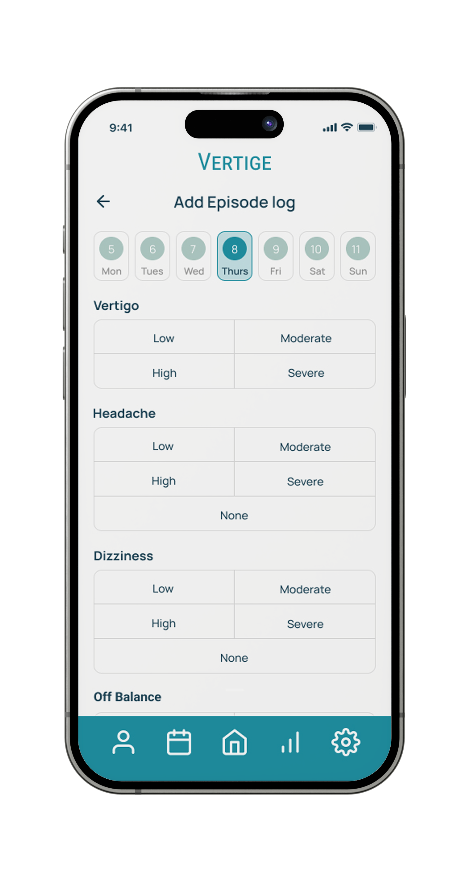
02 — Symptoms
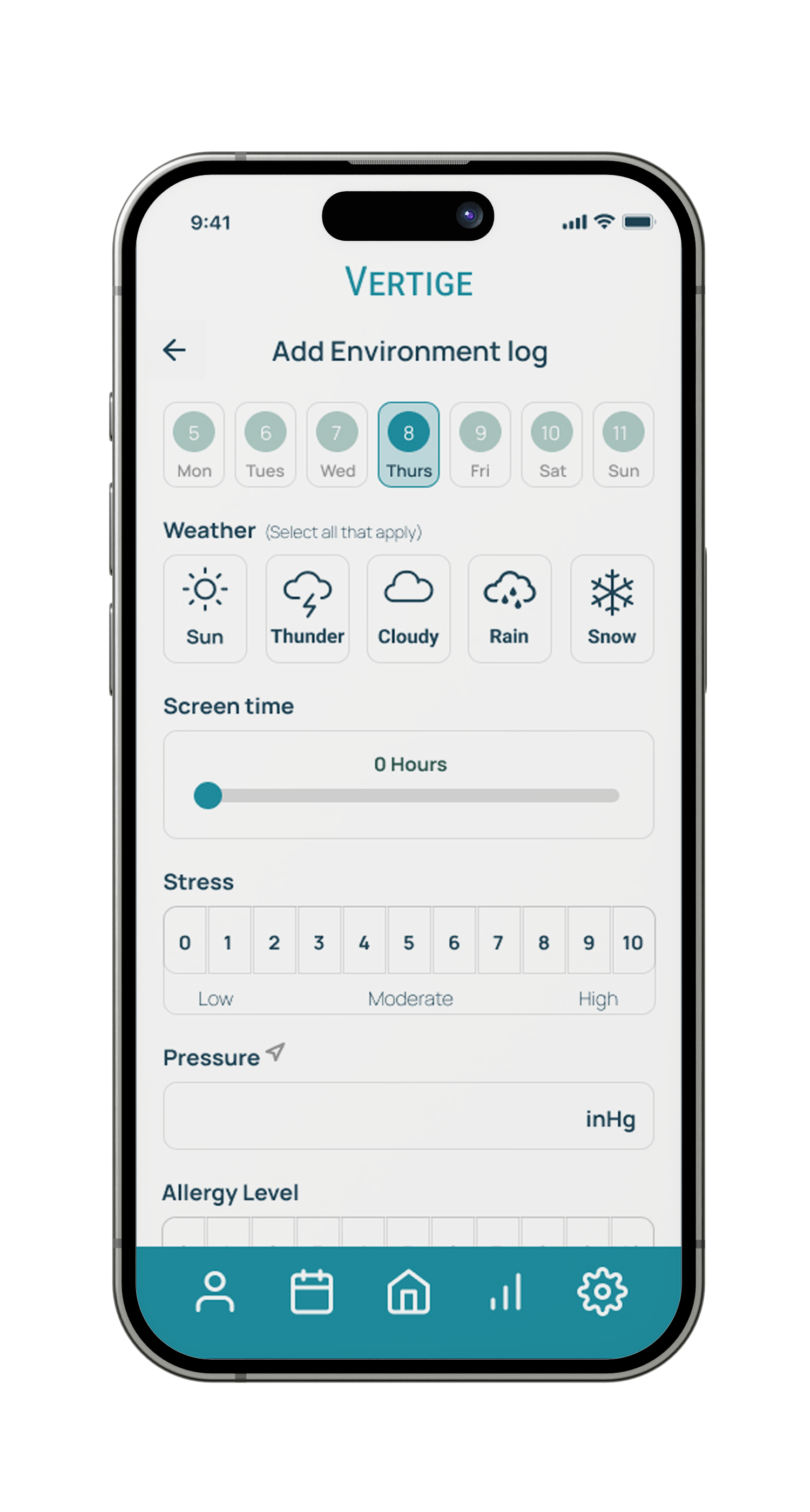
Track Weather & Barometric Pressure Automatically.

See how environmental changes may influence your symptoms.

03 — Weather
See Your Weeks Clearly.

Visual reports reveal trends, triggers, and progress at a glance.
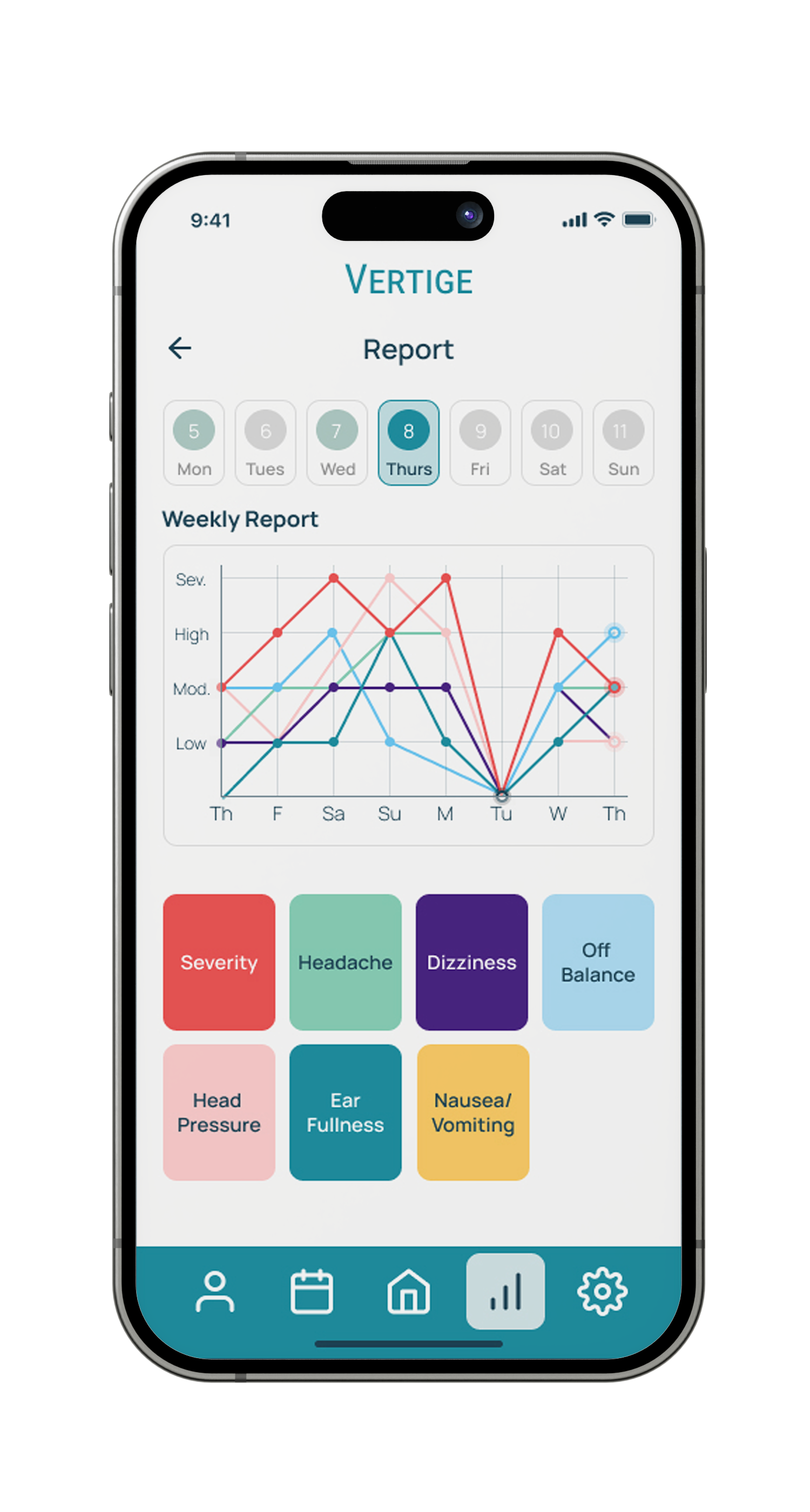
04 — Reports

Share Meaningful Data with Your Doctor.

Share organized reports for better conversations and care.
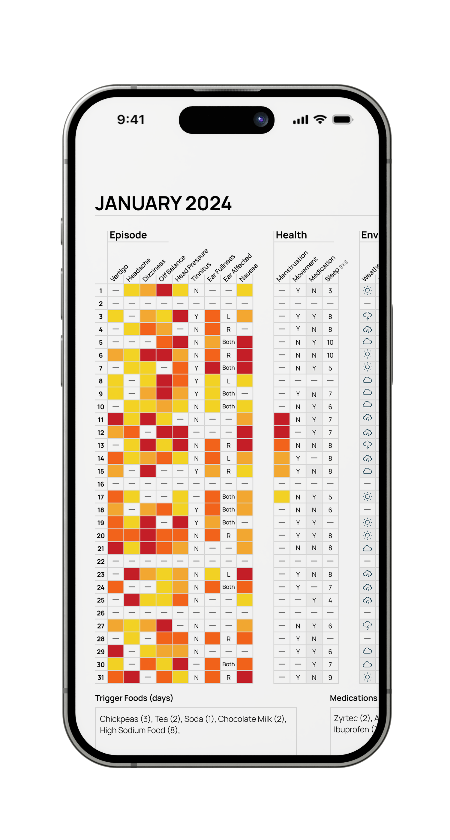
Export to PDF

05 — Doctor Data
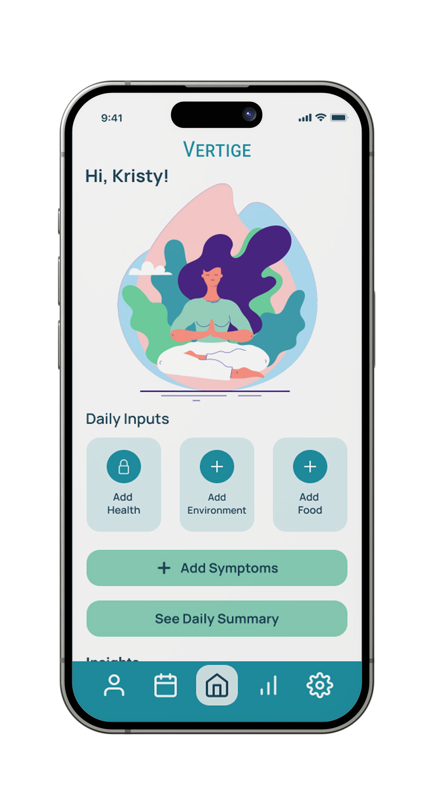
Small Steps. Steadier Days.

Understanding your patterns can bring confidence and calm.

06 — The Close

The character

Vivi wasn't a brief. She was a suggestion.

The founder mentioned Vivi almost as an aside — "we have the meditating lady that we call Vivi, do you

think we could add her into the mix?" It was an open question, not a requirement.

Using her was an easy decision. Vertigo is an isolating condition. The anxiety and depression that come

with vestibular disorders are as real as the physical symptoms, and Vertige's brand had always tried to

acknowledge that. Vivi — calm, grounded, meditative — carries that message visually without needing

words to explain it.

She opens the suite, closes it, and appears in the daily dashboard screen. Her presence gives the

screenshots a character that no competitor has, making Vertige immediately recognizable in a sea of

medical utility apps.

What this project taught me about

marketing design

A purely commercial deliverable — no UX problem to solve, no user flows to map. Just six screens that needed to make someone stop scrolling and download an app.

The biggest lesson was that copy and design aren't separate decisions. Getting the tone right first made every visual decision easier.

Being trusted with creative direction is a different kind of responsibility than being given a brief. Every decision needed a reason, not just an instinct.